 |
| Add caption |
Wednesday, December 28, 2011
KIDS Catelogue
This is an catelogue project I am doing for German performance artist Nadja Verena Marcin. Although the project is ongoing, here are a few finished page layouts to show the overall feel of the catelogue. The film itself is very intense with peculiar and strong subjects. The pages and color theme are very clean and elegant, so it brings forth the beautiful images from the film.
Tuesday, October 4, 2011
Dummies Cover Re-Design
 Everybody knows the Dummies series. However, not everyone likes the design of the covers. This project was to figure out a way to take away the scramble of information from the original covers and make the it look more organized, yet still recognizable and inviting.
The concept of this is recognized through touch. Each cover is corresponded to each other through the way the titles and icons seem to play out an action.
Thursday, May 19, 2011
Thesis: The Roots of Scars

Wounds teach lessons and as they heal, the scars are forever bound to the body as a memorable story. The stories behind them are often beautiful. However, because of their unappealing image, scars are sometimes misunderstood.
The subject of this thesis is to represent and bring into light the hidden stories that are usually not seen by others except the bearer. Together, they form an array of different experiences and memories.
In this installation, each scar is symbolized as a plant, growing and moving on. Although that is what you see on the surface, beneath are the roots that started it all, with each one telling its own narrative.


Sunday, December 19, 2010
Babysprout packaging
Babysprout is a baby food brand I designed for wary parents that want only organic ingredients for their baby. The logo is designed to look soft and affectionate. As for the food packaging, this is a set of lunch products for babies of stages one to three, each stage on the package is categorized by a different color. The important nutritional information is included on the side of the package.


Breathe Finished Editorials
These are a few spreads from my editorial magazine, "Breathe". The brand is focused on everyday women, looking for some sort of escape from their day. Therefore, the logo is very "in ease" and relaxed. The magazine promotes vacation spots, health and style. These are the finished pieces (one spread, one contents and two covers). All spreads contain a natural and soft feel, pretty much explaining the meaning of Breathe magazine.


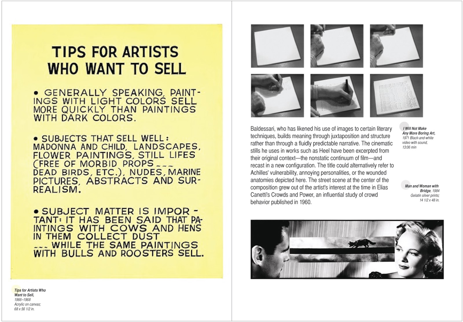
Baldessari book catelog
This is a museum catelog made for Metropolitan Museum's new Baldessari exhibit, featuring some of his work that's being displayed. The whole style of the catelog evokes Baldessari's own sense of style.
 |
| Front and back cover |
 |
| Introduction |
 |
| Second spread |
 |
| Third spread |
Friday, December 17, 2010

Thursday, December 16, 2010
1Byte packaging and logo design

 |
| Initial sketches |
Wednesday, November 17, 2010
Cochin: Type Specimen Sheet 08-09
This assignment was to show my understanding of typography and layout. Cochin was the font chosen.


Tuesday, November 16, 2010
Book cover designs for "In Cold Blood" by Truman Capote
The book In Cold Blood is a real historical account of the murder of the Clutter family in Holcomb, Kansas during 1959. My first goal was to capture the separate personalities of the two murderers that was described in depth throughout the story, leading to their ultimate death penalty.
The second cover was to show the chaotic process of finding the murderers and the regret of the perfect family of which were mercilessly killed.


The second cover was to show the chaotic process of finding the murderers and the regret of the perfect family of which were mercilessly killed.


Subscribe to:
Posts (Atom)